Monday, April 27, 2015

Microagression

Microaggression is a form of unintentional discrimination. In my life, I have people playing the Asian card and the girl card. Most often, microaggression affects me in a way that makes its seem like I'm only smart because I'm Asian. 
Personally I like math because in middle school I was learning high school math and I really enjoyed doing algebra. Because of microaggression, I can't say that I'm personally good at math because of my own enjoyment of the subject. Rather I get responses such as, "Of course you're good at math; you're Asian" and "Let me guess, you got a hundred on the math test again". I can't just be smart. I have to be smart because I'm Asian. My race has nothing to do with the fact that I'm good at math. It's simply a coincidence that my personality fits into the stereotype that "Asians are good at math." And it's not even a specific type of Asian; it's just "Asian".


Check out this tumblr page: I, Too, Am Harvard http://itooamharvard.tumblr.com/ for more about microaggression targeting race. 

Thursday, March 12, 2015

Creative Book Covers


I really like the typography of this book cover. In addition the simplicity of the cover really stands because of the contrast between the different parts of the cover. The words are close together and are somewhat blurred and faded at the edges. This leads the viewer to get a sense of age and a late 1900s history.


The simplicity of this design is pleasing to the eye. The colors used in the over-lapping D and H contrast with each other allowing an eye catching image. The combination of the letters might indicate an intersection or an overlap between two topics of the novel.

The Stranger's classic cover is not only simple but also revealing enough to draw attention to the subject of the novel. With the black angular points drawing to the right midsection of the cover allows for an emotion of being cornered and helpless. However because the points dont extend further the cover foreshadows that the pointed tips won't do any hard. I like that the title is not exacting in the center of the cover.

Love Today

The cover of this novel is extremely plain drawing attention to itself by contrasting with more complicated book covers. I like the font used for the cover. The different fonts go well together because one font is more rugged than the other allowing the viewer to have to decide at which to look at first.


The Giver has an interesting cover to it. At first glance the cover won't as much sense to the viewer. After reading the novel the meaning of the cover will be revealed.

Favorite Books

The book cover of The Mysterious Benedict Society successfully conveys the book's ideas, primarily the personality traits of the characters. Each figure on the cover represents a character in the book. The four people in color are the four main characters of the novel. The silhouettes are supporting characters in the novel. Fittingly they are shadows indicating that these characters contain secrets and are hiding information that they don't reveal right away.
The Mysterious Benedict Society is the first of four books and the cover designs for each are equally as enticing.

Announcement Posters

Before:
 After:
Another one:


Wednesday, February 25, 2015

Logo Design Project


After interviewing members of the Millennium High School Girls' Basketball Team, the Lady Phoenix, I designed a logo that would capture the essence of the team.
The most successful part of this design, in my opinion, are the wings with the orange-red gradient. While this took multiple attempts to do, I am happy with the results.
The hardest part of this project for me was finding a way to incorporate different components to the design without making the logo too complex or complicated. For example, I wanted to include the teams' mascot, the phoenix, but including a basketball was a given. In order to overcome this challenge, I did research and found different perspectives of a basketball that allows me to incorporate a bird with the design.

Monday, February 23, 2015

Mid Winter Recess

Mid-Winter Recess 2015
February 16th - February 20th: An entire week of no school, no homework, no worries

This past week, Mid-Winter Recess week, was my week to do nothing. The first day, Monday, I revisited the recreation center across the street from my apartment with my friend Roberto to play basketball. Unsurprisingly, I was the only person with two X chromosomes at the gym playing basketball. Tuesday passed as an uneventful binge-watching-TV type of day. Wednesday came around and Roberto and I went to the recreation center again, this time to participate in a 3-on-3 basketball tournament. During warm-ups I managed to jam the remaining fingers of my right hand that hadn't been jammed previously. Our third player, Tyrell, tried to dunk on me...multiple times during the games. Thursday was Chinese/Lunar New Year. I went to eat brunch with my mom and her friends in Chinatown. Afterwards, I met Roberto at the recreation center for the championship games of the 3-on-3 tournament. When I arrived at the gym, he told me that we had won by default because the other teams had been disqualified for not being at the gym on time. On Friday we went back to the recreation center to discuss the first place plaques. Saturday I had a scrimmage with the Millennium Basketball Team against Stuyvesant in the morning. Sunday I visited my uncle and his family for Chinese New Year and stayed home reading for the remainder of the day.

Sunday, February 1, 2015

Field Trip to the MoMA

Regents Week in New York is a week for high school students to take a break from stressing over school work to stressing over standardized tests. Thank goodness for New York City's many museums, most of which offer free admission to students. The museum is the perfect place to unwind from the stress of subjective testing and allows for the objective, creative sides of students to show.
Top to Bottom Left to Right: Jeff, Sofia, Derek,
Gabby, Arianna, Michael, ME, Raku

I met up with fellow students, designers, bloggers Jeff Huang and Michael Huff to go to the Museum of Modern Art, also known as the MoMA. At the MoMA we found our friends Raku Shigematsu and Sofia Martinez with Derek, Arianna, and Gabby. (It was almost a 9C reunion, with the exception of Michael and Gabby.) And Jodi Quan met up with us at the museum later that day.


Some pieces were breathtaking.
Others had a less than lucid meanings.


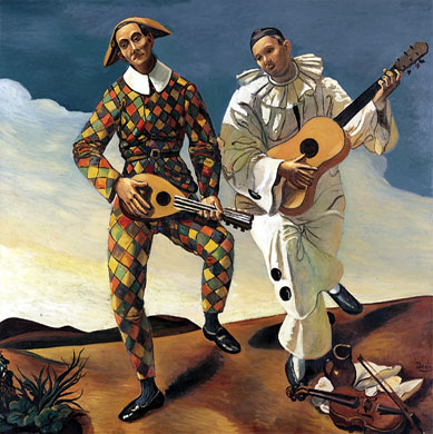
My favorite piece is Pablo Picasso's The Three Musicians. I studied this piece extensively in the sixth grade. This oil painting on canvas hung on a wall in the center of the floor acting as divider to the other pieces of art. Because of its extensive size, this painting occupied the entire wall. Pablo Picasso completed this along with another painting with the same title (see below) in 1921. The three figures in this image are, from left to right, Pierrot, a character from French plays, a harlequin, similar to a jester, and a monk.
This is the second The Three Musicians by Picasso.
Left to Right: Harlequin, Pierrot