Monday, April 27, 2015

Microagression

Microaggression is a form of unintentional discrimination. In my life, I have people playing the Asian card and the girl card. Most often, microaggression affects me in a way that makes its seem like I'm only smart because I'm Asian. 
Personally I like math because in middle school I was learning high school math and I really enjoyed doing algebra. Because of microaggression, I can't say that I'm personally good at math because of my own enjoyment of the subject. Rather I get responses such as, "Of course you're good at math; you're Asian" and "Let me guess, you got a hundred on the math test again". I can't just be smart. I have to be smart because I'm Asian. My race has nothing to do with the fact that I'm good at math. It's simply a coincidence that my personality fits into the stereotype that "Asians are good at math." And it's not even a specific type of Asian; it's just "Asian".


Check out this tumblr page: I, Too, Am Harvard http://itooamharvard.tumblr.com/ for more about microaggression targeting race. 

Thursday, March 12, 2015

Creative Book Covers


I really like the typography of this book cover. In addition the simplicity of the cover really stands because of the contrast between the different parts of the cover. The words are close together and are somewhat blurred and faded at the edges. This leads the viewer to get a sense of age and a late 1900s history.


The simplicity of this design is pleasing to the eye. The colors used in the over-lapping D and H contrast with each other allowing an eye catching image. The combination of the letters might indicate an intersection or an overlap between two topics of the novel.

The Stranger's classic cover is not only simple but also revealing enough to draw attention to the subject of the novel. With the black angular points drawing to the right midsection of the cover allows for an emotion of being cornered and helpless. However because the points dont extend further the cover foreshadows that the pointed tips won't do any hard. I like that the title is not exacting in the center of the cover.

Love Today

The cover of this novel is extremely plain drawing attention to itself by contrasting with more complicated book covers. I like the font used for the cover. The different fonts go well together because one font is more rugged than the other allowing the viewer to have to decide at which to look at first.


The Giver has an interesting cover to it. At first glance the cover won't as much sense to the viewer. After reading the novel the meaning of the cover will be revealed.

Favorite Books

The book cover of The Mysterious Benedict Society successfully conveys the book's ideas, primarily the personality traits of the characters. Each figure on the cover represents a character in the book. The four people in color are the four main characters of the novel. The silhouettes are supporting characters in the novel. Fittingly they are shadows indicating that these characters contain secrets and are hiding information that they don't reveal right away.
The Mysterious Benedict Society is the first of four books and the cover designs for each are equally as enticing.

Announcement Posters

Before:
 After:
Another one:


Wednesday, February 25, 2015

Logo Design Project


After interviewing members of the Millennium High School Girls' Basketball Team, the Lady Phoenix, I designed a logo that would capture the essence of the team.
The most successful part of this design, in my opinion, are the wings with the orange-red gradient. While this took multiple attempts to do, I am happy with the results.
The hardest part of this project for me was finding a way to incorporate different components to the design without making the logo too complex or complicated. For example, I wanted to include the teams' mascot, the phoenix, but including a basketball was a given. In order to overcome this challenge, I did research and found different perspectives of a basketball that allows me to incorporate a bird with the design.

Monday, February 23, 2015

Mid Winter Recess

Mid-Winter Recess 2015
February 16th - February 20th: An entire week of no school, no homework, no worries

This past week, Mid-Winter Recess week, was my week to do nothing. The first day, Monday, I revisited the recreation center across the street from my apartment with my friend Roberto to play basketball. Unsurprisingly, I was the only person with two X chromosomes at the gym playing basketball. Tuesday passed as an uneventful binge-watching-TV type of day. Wednesday came around and Roberto and I went to the recreation center again, this time to participate in a 3-on-3 basketball tournament. During warm-ups I managed to jam the remaining fingers of my right hand that hadn't been jammed previously. Our third player, Tyrell, tried to dunk on me...multiple times during the games. Thursday was Chinese/Lunar New Year. I went to eat brunch with my mom and her friends in Chinatown. Afterwards, I met Roberto at the recreation center for the championship games of the 3-on-3 tournament. When I arrived at the gym, he told me that we had won by default because the other teams had been disqualified for not being at the gym on time. On Friday we went back to the recreation center to discuss the first place plaques. Saturday I had a scrimmage with the Millennium Basketball Team against Stuyvesant in the morning. Sunday I visited my uncle and his family for Chinese New Year and stayed home reading for the remainder of the day.

Sunday, February 1, 2015

Field Trip to the MoMA

Regents Week in New York is a week for high school students to take a break from stressing over school work to stressing over standardized tests. Thank goodness for New York City's many museums, most of which offer free admission to students. The museum is the perfect place to unwind from the stress of subjective testing and allows for the objective, creative sides of students to show.
Top to Bottom Left to Right: Jeff, Sofia, Derek,
Gabby, Arianna, Michael, ME, Raku

I met up with fellow students, designers, bloggers Jeff Huang and Michael Huff to go to the Museum of Modern Art, also known as the MoMA. At the MoMA we found our friends Raku Shigematsu and Sofia Martinez with Derek, Arianna, and Gabby. (It was almost a 9C reunion, with the exception of Michael and Gabby.) And Jodi Quan met up with us at the museum later that day.


Some pieces were breathtaking.
Others had a less than lucid meanings.


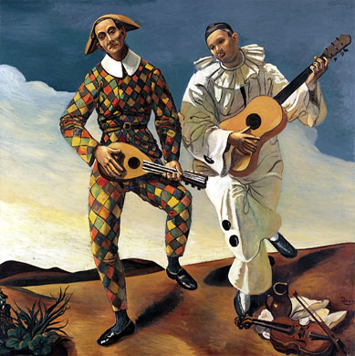
My favorite piece is Pablo Picasso's The Three Musicians. I studied this piece extensively in the sixth grade. This oil painting on canvas hung on a wall in the center of the floor acting as divider to the other pieces of art. Because of its extensive size, this painting occupied the entire wall. Pablo Picasso completed this along with another painting with the same title (see below) in 1921. The three figures in this image are, from left to right, Pierrot, a character from French plays, a harlequin, similar to a jester, and a monk.
This is the second The Three Musicians by Picasso.
Left to Right: Harlequin, Pierrot


Sunday, January 11, 2015

6 Typefaces


Modern, Script
The Modern font conveys the message that au bon pain is a modernized bakery but the script gives the bakery that home-like feel.

San Serif
The San Serif font is smooth and equal along the edges giving Starbucks the fresh, clean appearance.

Decorative
The Decorative font for this book is able to convey the message that a single slash could be the means of a character's demise. 

Decorative, Slab Serif
The M from MBHS is composed of the bridge while the BHS is in Slab Serif to signify that the school, despite being created about a decade ago, has the foundation to have its own legacy.

Old Style
The Wendy's logo and slogan is in Old Style font allowing the chain restaurant's logo to go along with the idea that Wendy's has been around for a while and, for their loyal consumers, will not be changing anytime soon.

Photoshop GIF Project Reflection

IT'S TIME TO FOCUS
While using Photoshop, what was the most frustrating aspect of the program and/or project? (Ex. Tools, translating sketch to design, creating transitional layers, etc.)
For me the most frustrating aspect of using Photoshop was not being able to physically draw the symbol and each image. The only way to do so was to make a flip book of some sort or purchasing a drawing pad and bringing that to class everyday. In addition to not being able to physically draw the GIF, I was also frustrated by coming up with a design that conveyed a specific concept in such something so small and quick as a GIF. 
After completing the project, which tools do you feel most confident in using?
The tool I am most confident in using is the brush tool because it is one of the tools that allow me to alter the images on each layer the most freely. While the other tools had restrictions, such as only being allowed to move a selected section rather than the image as a whole, the paint tool had only two requirements: the layer had to be visible and it had to be selected.  
Which Tool do you wish you were better at using? Explain why.
I wish I was better at the magic wand tool because it still confuses me as to how it functions and how its operations can be used to my advantage. The purpose of the magic wand tool is a vague idea to me. The only thing I can recall about it is that it should allow the designer to match the colors of the brush tools and the paint tools to the color already on the image. 
What would you like to create next with Photoshop­­­­­?
Next with Photoshop I would like to create an image that has been visibly altered to convey a message that calls society to action. This is something I am interested in because of the recent amount of designers displaying their creations in which people are challenged to view something or someone in a certain way. Designers are able to move their audiences and make them think about their lives and the lives of others. And genuinely I believe that this is a way to slowly incite change in our chaotic world. As my GIF shows, I believe that it is time that our society really focuses on the problems in our world rather than teaching our children and even lying to ourselves that they do not exist.

Millennium Girls' Basketball Team

Coached by Brian McCarthy and led by captains Elizabeth "Lizzy" Chan (Senior at MHS) and Nyasia Caroll (Sophomore at MBHS), the Millennium Girls' Basketball Team is aiming for the city championship this year because of the number of senior players on the team. Collectively, the girls and the coach know that they're ready for the challenge of having a perfect, undefeated season and making it through the many playoff games to win the title of "City Champions".

Interview with the players:
Q: Why do you want to win the championship this year?
A: I want to win it because of the seniors on this team. We had a chance at it last year but we weren't ready then. This year, we're definitely a stronger, better team. This is our seniors' last chance to win this before they graduate. We have a really good shot at winning. Last years' city "champ" only lost one game their entire season and that game was to us. We can win this, I believe we can.

Q: How has Coach McCarthy been training you for this championship?
A: [Coach] McCarthy has come up with new plays and has also set up scrimmages and nonleague games for us to play to practice for the playoffs. We have played multiple Division A teams to practice for the tougher teams that we will face in the playoffs. We also took a weekend trip to Albany where we played against some of their girls' teams.

Q: How is the season going so far?
A: We haven't lost a league game yet so I'm pretty optimistic about this year. Our point guard, Nyasia, is ranked with the tenth highest assists in the city. Lizzy has been recruited to play Division III basketball in college. We have a lot of new girls (freshmen) that work hard during practice.

Upon asking the girls about the new logo design, they have agreed that it would be best to stay with the tradition Millennium colors for the design. In addition, the logo should include the distinguishing phoenix that our school has been accustomed to be associated with.

Portrait Transformation

The concept for this portrait transformation is a commentary on New York City life as told by a New Yorker, rather than someone that believes they have been to New York enough times to label it. The girl looks on as a train rushes past her, similarly to how fast pace New York City moves. There are a few distinguishable details in the train, such as the window and a separation between the cars. A window is meant for and individual to be able to look inside and observe. The blurred window of the moving train is challenging those viewing it to look inside and think about what they actually see versus what they believe they see in New York and in New Yorkers. The separation in the cars puts into perspective the way New Yorkers stay connected as a community even in the smallest ways and are always ready to help, despite the stereotype that we are cold and rude individuals. The image was transformed by a black and white filter to demonstrate that despite our stereotypes to outsiders, New York life is not all black and white. As demonstrated by the color in the girls head, there is more to a New Yorker than what meets the eyes. The girl's hair represents the burst of freshness that New York has to offer to locals and to newcomers. The concept of this image is a call to those who have been to New York or have heard about it; it is a call that coming to this great city is completely different than experiencing it.